Wednesday, June 27, 2012

You are my kind of cool 

This is my contribution for MFT's challange for july's guest designer. The stamped image is Harlow by TGF's Creepin crew collection 1. I'm super duper excited about my colouring of her jeans. I'm new to colouring with shadows and alcohol pens. I've had them for a couple of years, but it's just lately - thanks to youtube - that I've discovered how to blend and shadow with them. I was really nervous that I wouldn't make her justice and manage to make her cool enough, but I outdid myself this time with this colour combination.
In the corner I used the Fishtail Banner without the scalloped edge and I die cut the letters from Tim Holtz "Typeset" in black. All the flowers are from IAR and coloured with LSG. To match the image the base is Nantucket pearls in clam bake beige and whale watch blue. I then accented the edges with passionate plum and afternoon delight demin from the naughty and nice set. The leaves are in a tan brown colour (ZQLO-74/75) and I coloured them in sea grass green and envy with green. The tan does add an extra depth to the colour and really match the paper which is from Tim Holtz lost and found paper stash.
The rest of the sentiment is die cut with the first place award ribbon. The sentiment looks a bit different, but I really wanted it on one straight line. There is a little sticker from Tim Holtz chit chat stickers, since I couldn't fit "are" on the die. I just got my order from MTF in time to be able to put a leafy flourish on the card as well. It was the perfect first timer for this die. I also got the large leafy flower and it is huge!! And wonderful, can't wait to create something with that one - LOL!
 

 I actually, for once, finished the inside of my card before I know who I will send it to. This, also because of my just arrived order. Of course, I bought enough to qualify for the triple scoop set. Like that's a challange - haha! I got this great set of stamps with "you are" sentiments. You are so beautiful, you are pretty amazing, you're my best friend - great set! (I just checked back at MFT and they're sold out of this set, so check back again! I've noticed that they sometimes stock up the triple scoop set again) But I could not help but to use this sentiment "Really, you are!" With my sentiment from TGF - match made in heaven or what do you think?

You must check out MTF! I'm already popping back for more and July's releases are just around the corner - so what are you waiting for? Hurry!


Thursday, June 21, 2012

Scrap challange

I have just about finished an album of a great vacation to Asia and had a lot of scraps left over.
So I decided to challenge myself using nothing but scraps to make a card to a friend who's flying in tonight. Here's the result. 

Sorry about the poor light

I'm quite pleased, as layering is not my strong side. But I love the effect, so I'm practising a lot - LOL!

The paper is creme and rose cardstock, layered with bits from prima - script and G45 - kraft reflections. I also die cut a decorative doily from MFT and cut it in pieces from prima - script paper. On top of it I added a Tim Holtz journaling ticket and stamped with archival ink in coffee.

The flowers are all from I am roses. I cut a skeleton leaf, as it was to big for the card. I painted a white R21 in "a bit o bubbly" from LSG. The larger leaf is in "opal sea oats" from LSG and the smaller rose leafs are a naturale in tan brown. The two small blossoms are S10 in brown.

I hope she like it!

Thursday, June 14, 2012

I AM ROSES card

Here is one of my absolute favourite cards. It was super easy to make and came together super fast. I'm one of those who usually have to sort of squeeze out inspiration - LOL!
This, for me, was new territory and I purchased a 7 gypsies paper pad. Off the Wall 8x8. But now I find it hard to go back. I'd like to thank all of you who take the time upload you tube videos of your projects and hauls. I find so much inspiration in all of you! 
 

The card's size is app 6x5. I love brown tones, but somehow it took me a while to embrace the vintage style in my art. I believe I'm still learning what's my style, so I experiment a lot now a days. The sentiment is from Cloud9design clear stamps simple thoughts - Laughter. It looks a bit different, but I stamped parts of it separate to make it look like this. I used adirondack expresso. I also embellished it with bits of Prima say it in pearls.

To be honest, I was a bit in a hurry when I made this and only wanted simple. So I just cut the paper. Usually I'm a bit fussy about cutting in paper like this. I tend to overthink if I get scraps I can't use, the size and proportions, how do I coordinate embellishment and colour combination and so on. For this card I had just about five minutes. So it was more or less cut - cut, lightly distress, ATG togheter, stamp sentiment on one of the scrap pieces, add flowers and bling. So, simple and fast - with so much result?! I still can't believe I made this so effortless - LOL!


I started with a short spray in tan as my "base".
SP1 - 740 (Love this one!!!)

Then I added cherry blossoms in a light brown colour from the mixed pack S3 - 827
(Gorgeous mix of brown tones!)

As a final touch I added som dark brown mini roses from R2 - 310, also a mixed pack.

I love giving away handmade cards and know that the receiver appreciates the very thought and effort you put in it. But this card was especially hard to part from.


Thanks for stopping by, may inspiration keep filling your hearts!


Gift wrapping and a card

I made a great gift wrapping paper with a couple of stamps.
The base is simple brown paper, I believe I bought it at IKEA for basicly nothing. I pimped it with stamps from Tim Holtz Mini Ornates and Bo bunny's Timepiece in fired brick and brushed corduroy. It literally took me only a minute as I stamped the paper randomly, mostly in the brown colour and the red is only as accent.


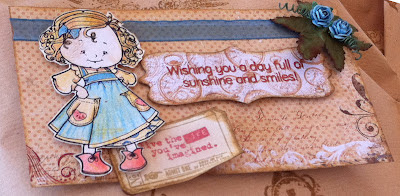
The card's size is approximately 6x3. The base is from the Bo Bunny Timepiece paper pad 6x6. Is it so beautiful on it's own, I didn't want to cover it. I estimated the height based on the stamped image from TGF Grandparents set, which is coloured with pencils and fussy cut. I cut out an ornate shape also from the paper pad and stamped the sentiment from Hero Arts Sending Smiles. The ticket tucked underneath the image is from Tim Holtz Odds and Ends. Since I coloured the image first, I wanted to tie the blue dress to the card. So I added the blue organza ribbon and the blue flowers. I think it turned out ok. 
Let me know what you think.


'til next time!

Wednesday, June 6, 2012

Bead spray

After watching the tutorial by Luvleescrappin, I had to give it a go.

I love sprays, but have a hard time finding any at a reasonable price. So I was thrilled about the idea to be able to make them myself. I was surprised how easy it was - so BIG THANKS to Leanne for sharing such a wonderful tip and taking the time to make a video about it!

At first, I started small and made spray for a specific project I had in mind. But then it was so much fun I had to make another one right away, just to see if it was beginners luck - haha!

I don't have that many beads to choose from, but I have a mix of blue that I purchased at Panduro some time ago for a baby boy project. So I started to sort through the mix and wondered how I would be able to use them in non-boy projects. Anyhow, since I was just playing with the concept I gave it a go with just the dark blue beads. And look at the result! I'm really pleased, I did not think I would be able to make something like that. Doesn't it look just like delicious blueberries too?

So, feeling the inspiration flowing, I started on yet another one in the other colours and now I'm getting big and bold. So naturally, I ran out of wire. So I'm sitting and wondering for the life of me - what am I supposed to do now?  While I'm spinning and turning this unfinished piece, I realise I've seen this colour combination before...

And would you believe it?! It's exactly the same as Prima say it in pearls blue. How did I get so lucky?!

By this time, I'm now thinking the sprays so beautiful I don't think I can manage to cover them behind flowers and leafs, where I usually put them. So I give it a go to make just a few simple ones as well - not bad or what do you think?

Finally, all in all. I believe I got all of these made in just a few hours. If that is not productive, then I don't know what is!

'Til next time, may inspiration keep flowing!
Thanks for stopping by! I must now expand my bead supply - LOL!

Sunday, June 3, 2012

MFT card with PI Fairy girl

The card is based on the MFTGUESTDT0612-sketch. One of the criteria was to use a MTF stamp and I took the adorable PI fariy girl, as you can see I left out the magic mushroom. The base is a baby blue background on double folded creme cardstock. The inside is not finished yet, I'll get to that when I know to whom I will send it and if I need much space to write. The card measure approximately 6, 3/8 x 5 inches.

The stamped image is mounted on a pastel coloured cardstock in light purple, all the edges are distressed and later popped up on foam dots. Behind it is a bit of core'dination paper in tumbled glass, which I ran through my Big shot and than sprayed with the drink me silly blue. I embossed it using the damask texture fade by Tim Holtz.

I coloured her skin with LSG "Drink me silly"-set, first I used the magicals and then I evened the tone with the starburst sprays (I dipped a finetipped brush in the bottles). I'm really pleased with the outcome, the pastel colours are perfectly cute and summery.
Colouring: Wings - A Bit o'Bubbly, Dress - Cosmopolitan Pink, Shoes and accessories - Fussy Navel Peach, Belt - Blue Hawaiian Blue, Grass - My Mojito Green, Hair - Dark Chocolate Truffle.
For the sparkle in her wand I put a pink rhinestone. For her skin I used copic and promarker pens.


The dies I have used are The double scallop border, which I cut out twice and mirrored on the card. I hid the cut underneath a self adhesive white pearlstrip by Kaiserkraft. The sketch also showed a tab and I have The File Tab, which I had in mind to use, but as it turned out it was to big compared to the picture. So instead I used one side of the die from The framed greetings die and stamp set. It turned out even better than I expected so I will use this as a tab on more of my projects from now on. I'm really excited to have gotten extra value out of a die "by accident". The tab is cut from pink glitter paper, but to accent it even more, I also put the same rhinestones as I used on her wand. To even the balance of the card I also used the fancy flourish, painted it with fussy peach magical and stuck it between the tab and the border. It took over a bit more than I wanted. I hope you still notice the border, which became a bit paler in comparison.


As the second border I used the wider ribbon of The First Place Award Ribbon die-namics and stuck it on both sides of the fairy girl. The sentiment is from the framed greeting set and actually says "Thank you for all that you do", but I only stamped the "Thank you". I also wanted some flourish in the stamped image so I used The Vintage Flourish die, nipped it in half and stuck it among the flowers as sprays. Also here I put some pearls from Kaiserkraft to accent. To give it an extra finish I also stamped another sentiment from the framed greetings set. This was the sentiment that I wanted to use from the beginning, but I couldn't fit it on the border. But I'm glad I eventually found space for it anyway.

I hope you liked it, I'm really pleased with the result and had so much fun making it.
Until next time check out MFT - you will be inspired, I have the longest wishlist!