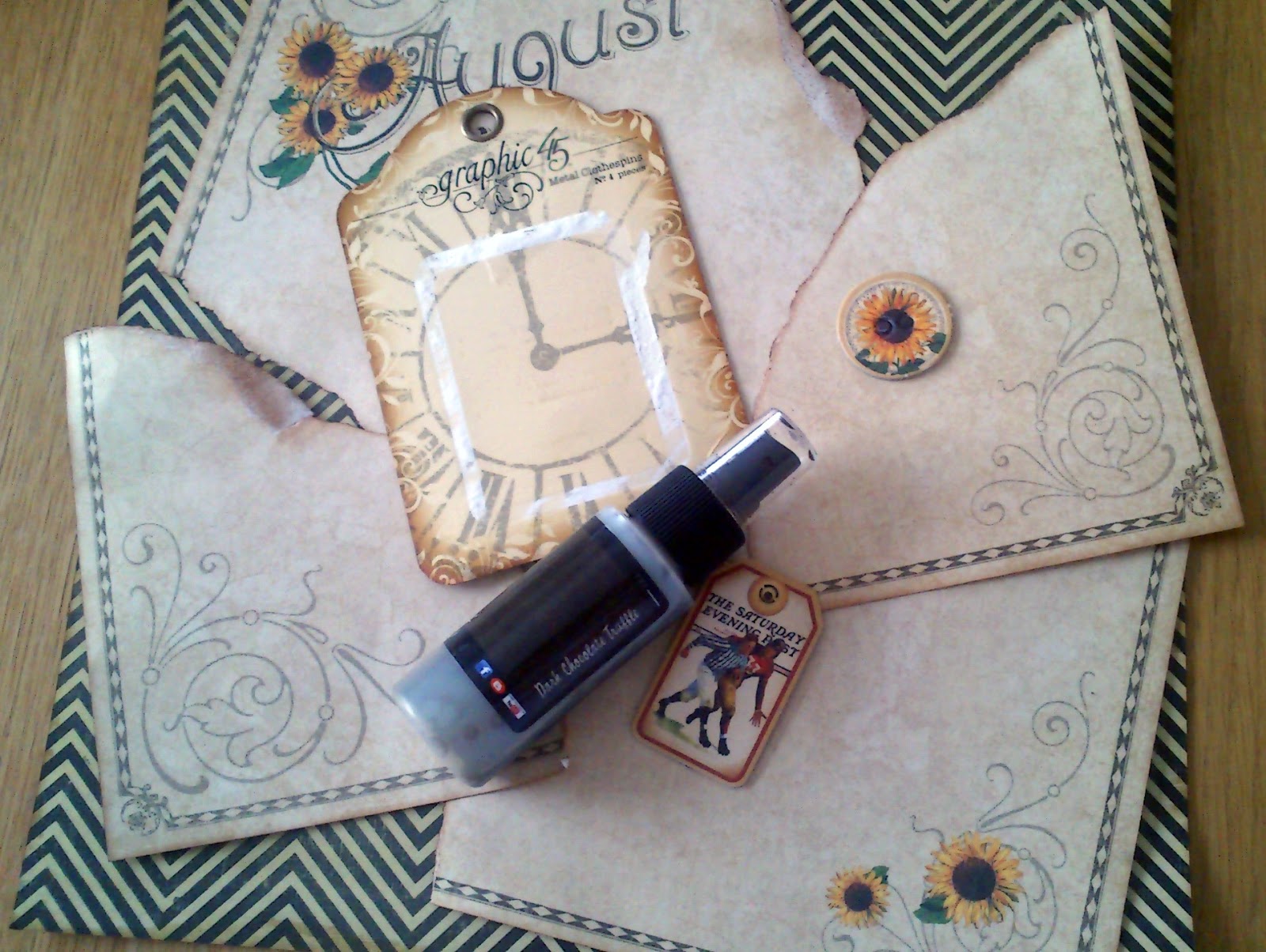
As I've mentioned before I'm not aload to show the actual pictures. But I understand that the blurriness messes up the work that is put in the the project. So here I carefully put the embellishments around the photo mat and stamped a piece of card to replace the photo for this post.
I just had the best time putting this together. The photo has lots of sun flowers in it along with a young boy. So the August mat was just perfect. I ripped the corners since there are only two swirls on each side and I wanted them all to show. So I distressed all the edges with vintage photo and then I glued it on to another 12x12 paper from DCWV tradewinde pad and to "bind" it together I splattered Lindy's stamp gang dark chocolate truffle on top of it. I'm thrilled with the result and very impressed with myself for coming up with the idea - LOL!

But let me tell you about the embellishments I did add. I thought the puffy daisy from I am roses would make great sunflowers, to get the perfect golden yellow I used several of my LSG's. Golden sleighbell, grab a guy gold and glory of the seas gold turned out to be a huge hit togheter. So super sunny and super shimmery. I added a button with twine. I made a banner with the MFT banner die, but in order to make it bend like I wanted I cut it apart and hot glued it to twine. The stickers are from Jenni Bowlin and spells "sunflower" in Swedish.
I up-cykled a staples packaging, I really like it and added a butterfly on top of it. The butterflies are from Tim Holtz stamp set papillon in espresso that I fuzzy cut. I will do more of these, super easy and cute to have a stash of. I also put a double scalloped MFT die cut under the side of the photo mat too. I used a lot ot MFT dies on this layout:) Both the large and the small leafy flourish and the layered label die.
On the layered label die I stuck a sticker from the place in time sticker sheet. I also tucked a chipboard piece from the place in time, merely for the colours and a bit boyish embellishment. I also used to stamp with the sunflower from the paper collection. On the opposite side of the photo mat is a chipboard piece from Prima.
I hope you like it, this became one of my best layouts and I could problably have done a lot more, but I'm kind of limited since I need it to stay somewhat flat.
Thanks for stopping by!


No comments:
Post a Comment